Introduction
The spencer Design System provides a comprehensive framework for creating consistent, accessible, and user-friendly medical device interfaces. This system ensures that all spencer products maintain high standards of usability while prioritizing patient safety and medication adherence.
Medication Management
Scheduled dispensing of pre-packaged medications with clear instructions and reminders.
User Experience
Simple, accessible interface designed for users of all ages and technical abilities.
Safety Features
Built-in safeguards to prevent medication errors and tracking capabilities for healthcare providers.
Color System
Our color palette is designed for clarity and accessibility, ensuring all users can effectively interact with the device interface.
#2E5899
#4B9CD3
#4CAF50
#FF9800
#F44336
Typography
Logos
spencer Logo
 Default
  White
White Logo Usage
The Spencer logo should maintain clear space around it. Minimum size for use is 100px wide.
Icons
Icon Guidelines
Maintain consistent stroke width and corner radius across all icons. Icons can be displayed in any color but should maintain sufficient contrast with their background.
Buttons
Standard Buttons


Button Sizes


Button Guidelines
- Use clear, action-oriented button text
- Maintain consistent padding and sizing
- Ensure adequate touch targets (minimum 44px height)
- Use appropriate button styles based on action importance
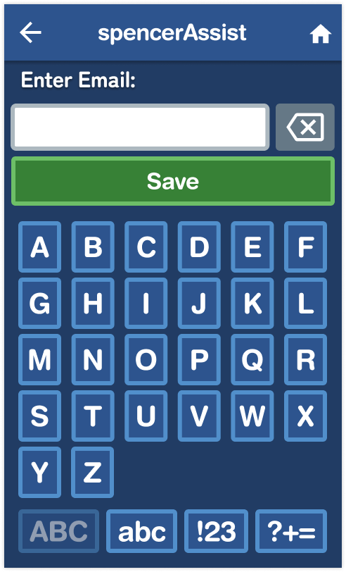
Password Interface
Header Components
- Consistent navigation pattern
- High contrast for visibility
Input Elements
- Large, clear input fields
- Visual feedback on interaction
- Clear error handling
Custom Keyboard
- Optimized key size and spacing
- Clear character grouping
- Multiple character set support
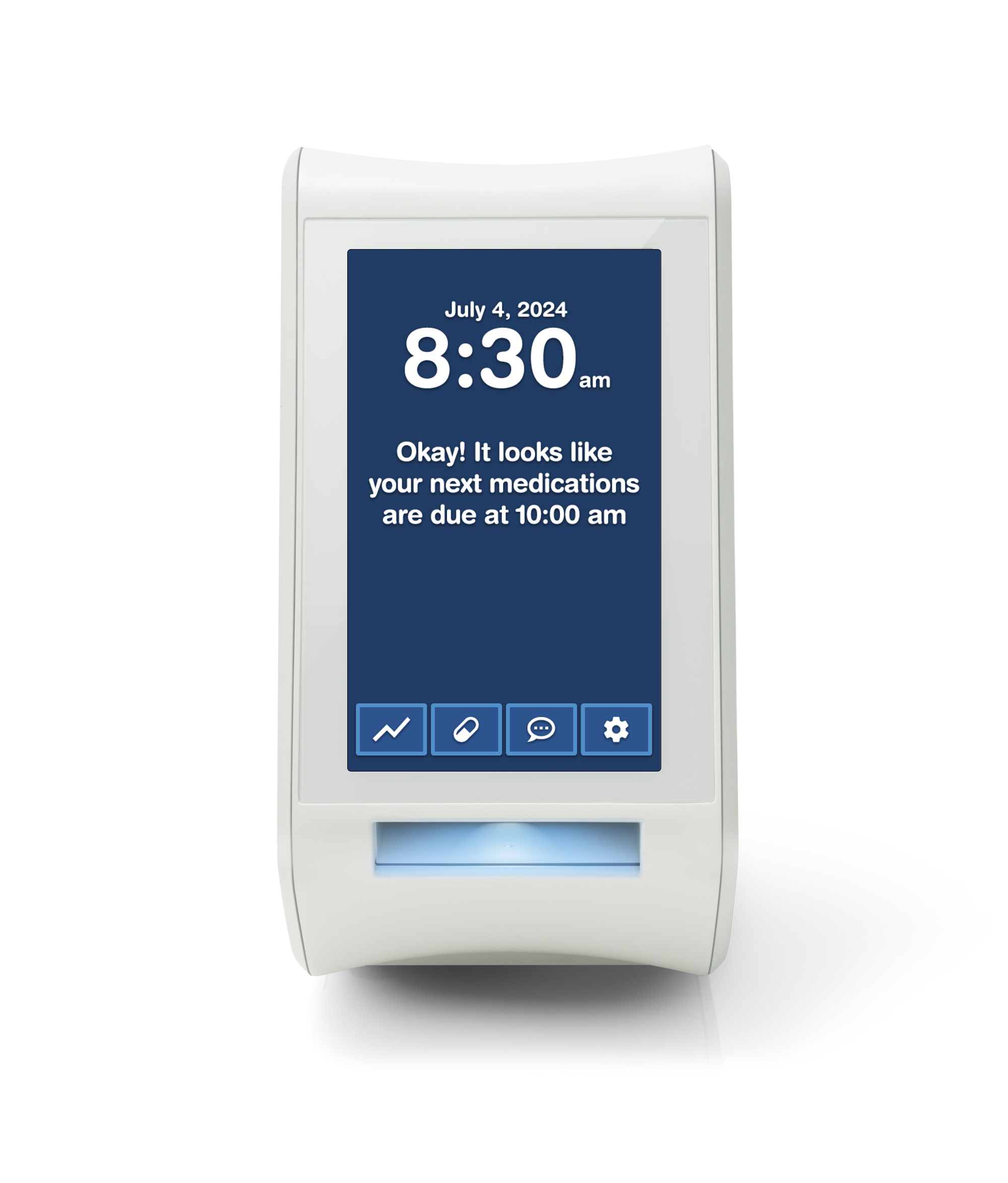
Device Screens
Home
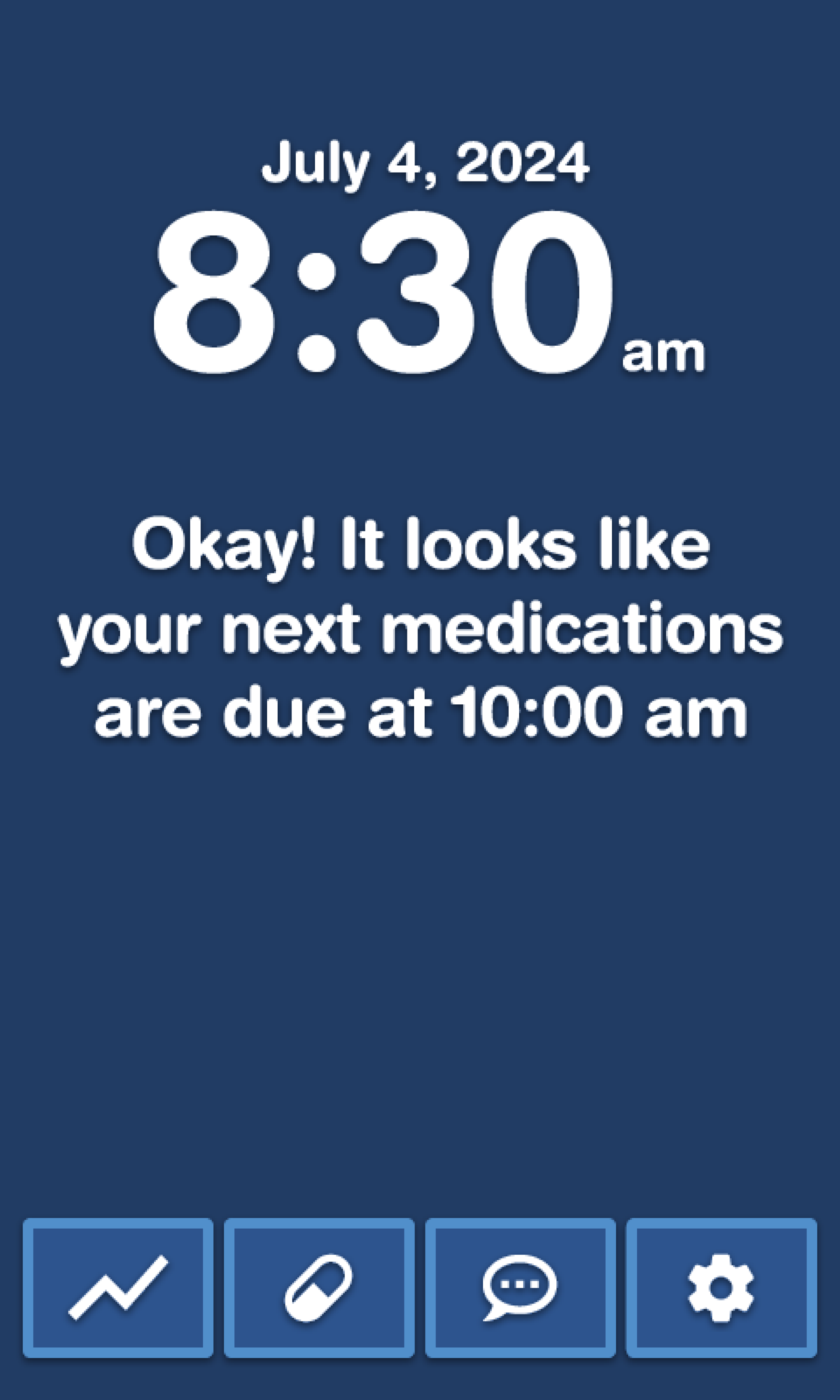
Dispense
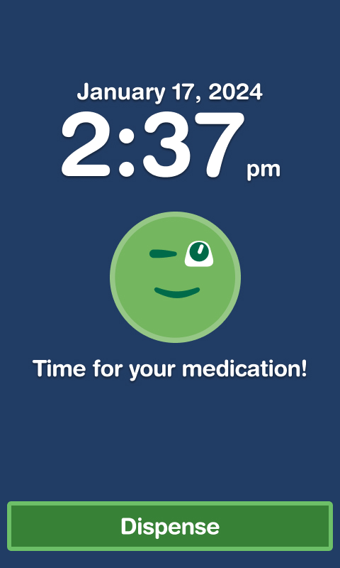


For full list of device screens see Figma boards
Screen Guidelines
- Maintain consistent layout patterns
- Use clear visual hierarchy
- Provide adequate touch targets
- Include clear feedback for all actions